We recently caught up with Corrie Spence, joint owner of @thespencehome Instagram account. Corrie and Joel are in the middle of a huge home renovation and are kicking off 2024 planning and designing a new kitchen.
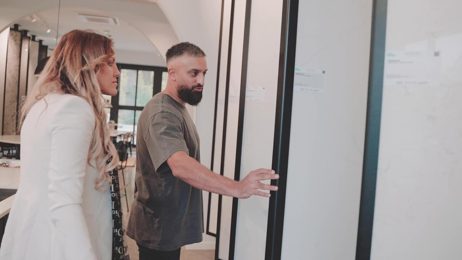
Corrie visited us here at the York, Rossmoor showroom to see her chosen sample in its full slab glory, share more about her vision and check out our range of stunning sinks and taps. Corrie and Joel are creating a beautiful, modern classic shaker kitchen and no detail has been spared. Here Corrie shares all the behind the scenes plans, design choices for her Minerox Quartz worktops and what she looks forward to most once the kitchen is complete.
Taking on this project was to create a fresh start in our new home. After moving in last July, it was clear that the house, previously occupied for over 50 years, needed a complete revamp, including electrical, mains, and plumbing updates. The main goal was to create a modern yet traditional kitchen, maintaining the original charm while optimising space.
The plans involved gutting the entire kitchen whilst incorporating the period architecture into our modern design. We love the period pieces within this space and want to take full advantage of these in our kitchen as they link to our design perfectly.
The coving and panelling maintain a traditional feel, balanced with modern elements for family living. The addition of the conservatory left by the previous owners does not really go with our vision, and by knocking through we are able to create a big open plan kitchen. Other changes include removing the coal room, toilet, a conservatory, creating a small glass extension at the back.
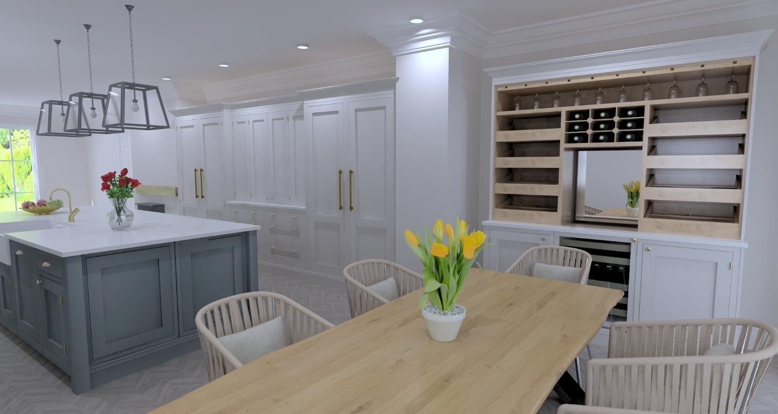
The envisioned open-plan kitchen-dining space features French doors, bi-fold doors, and a prominent island for a versatile and inviting living space . The addition of a snug and wine wall enhances functionality, and practicality, offering comfort and flexibility for family moments and gatherings. The central island encourages seamless movement between spaces, making the kitchen area the perfect place with plenty of places for all our guests
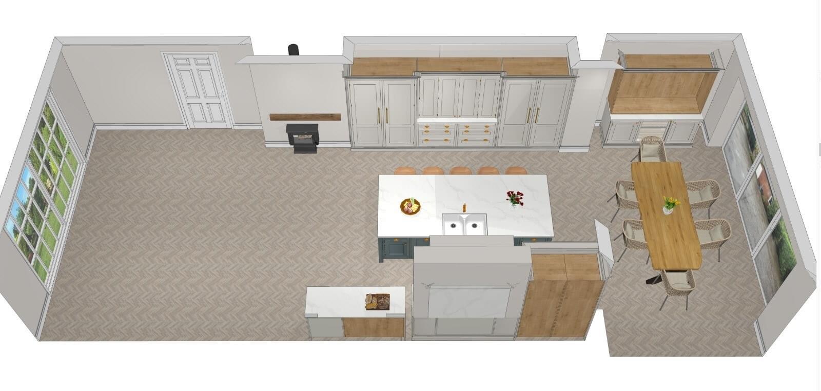
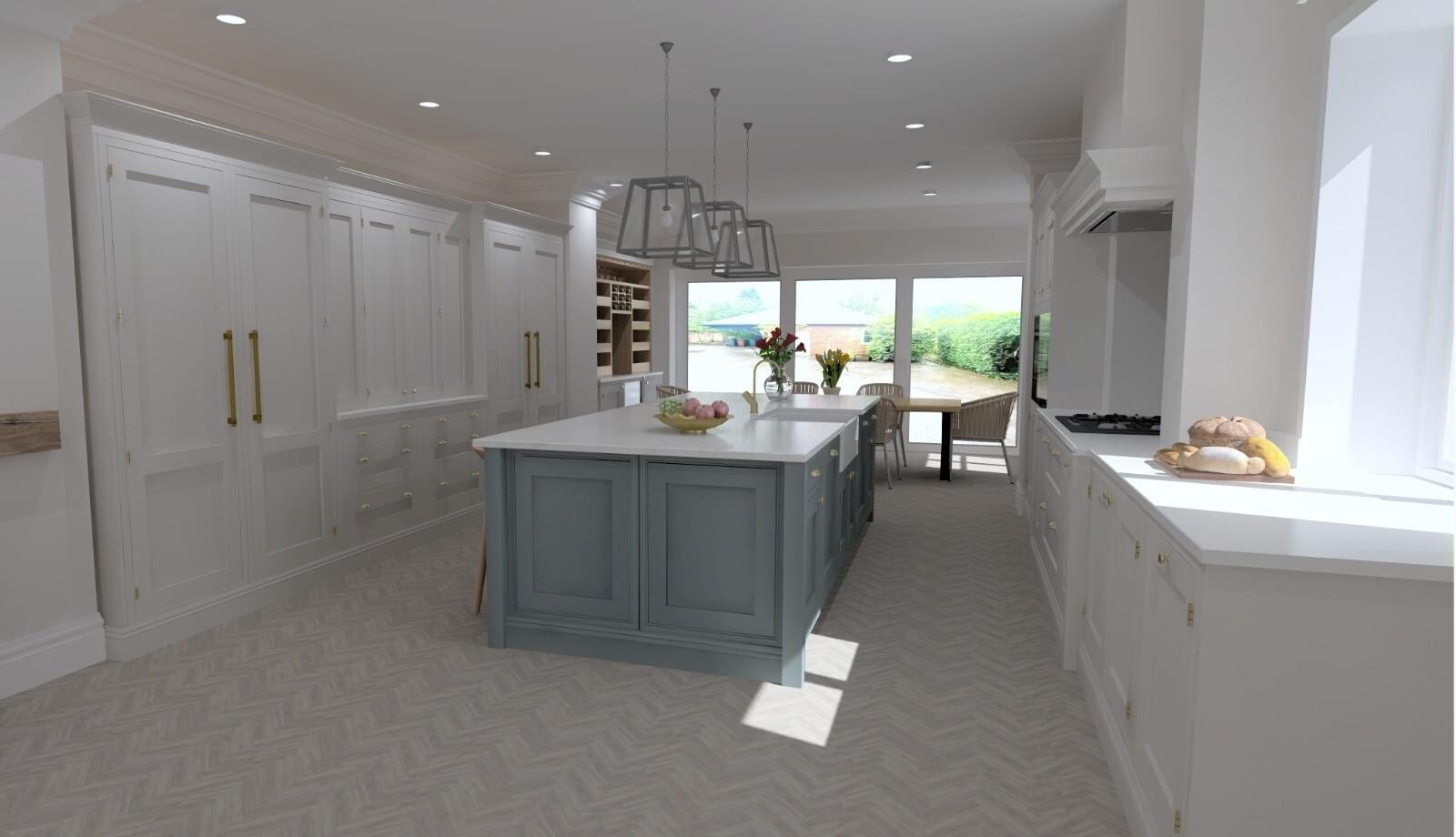
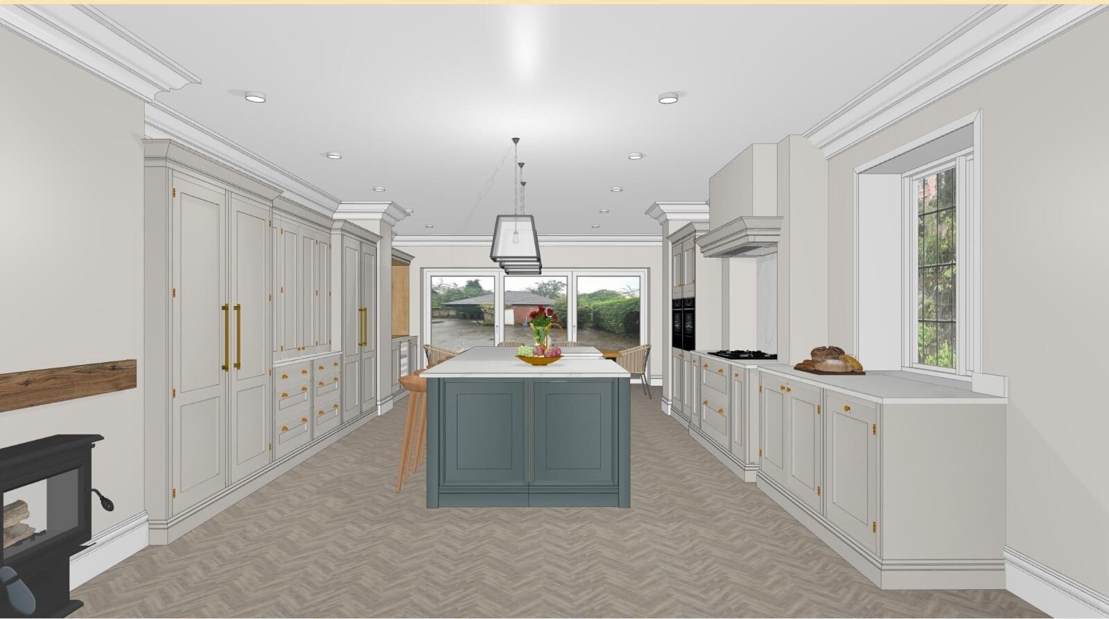
Our new kitchen design embodies a traditional aesthetic with a contemporary twist, featuring bespoke built, shaker-style cabinets in a framed layout. Situated in a period property, the kitchen's uniqueness is highlighted by some of the design elements. Incorporating the traditional fireplaces into the design, creates a warm and inviting setting.
The choice of colour scheme for our kitchen is a blend of Farrow and Ball blues for the island, complemented by white and neutrals, evoking authentic Edwardian charm. The inclusion of stained-glass windows adds character and further enhances the timeless appeal. Throughout the kitchen, gold accents, including taps, bring a touch of sophistication. To maintain the charm of the space, the original doors have been carefully restored, preserving the character of this thoughtfully designed traditional space.
The inspiration behind our new kitchen came from the refined and elegant aesthetics of the Edwardian period kitchen, drawing influence from timeless styles found on platforms like Pinterest I would spend the evenings taking inspiration from similar styles and making mood boards.
Seeking ideas from what others had done, we collaborated with a kitchen company, opting for a shaker style that beautifully marries the traditional charm of Edwardian design with subtle modern elements, resulting in a unique and harmonious blend of classic and modern influences in our kitchen renovation.
Our decision to choose Gemini Worktops for our kitchen project was guided by thorough research and positive recommendations. After researching various worktop options, we reached out to a reputable kitchen design company, who highly recommended Gemini Worktops. Impressed by the positive reviews and word-of-mouth referrals, we researched deeper into Gemini through social media, particularly on Instagram. A post about their high ratings and satisfied customers further set our confidence in their services.
As we had a plan in mind on how we wanted our kitchen to look, it was important we considered the colours available on the website to ensure they aligned seamlessly with our design. Originally our preference for worktops was granite but then decided against this as durability and practical benefits of quartz ticked all the boxes for our desired aesthetic appeal- not to mention they are long lasting and high quality.
The choice of Siena Gold worktops for our kitchen was driven by the desire for a subtle yet modern look. We appreciated the balance it struck, providing a contemporary feel without being overly extravagant. Siena Gold seamlessly incorporates traditional elements while introducing a touch of subtle beauty, contributing to the overall elegance.
Siena Gold offers a refreshing alternative to plain white options that we found dull. The worktop's ability to bridge the gap between Edwardian tradition and modern design, particularly with the inclusion of a traditional style ogee edge, resonated with our vision, adding a touch of timeless charm to our kitchen space.

I am excited about the completion of our new kitchen to simply enjoy the space we have designed. It is a journey we have undertaken, investing time and effort to ensure it blends seamlessly with the rest of the house. I look forward to highlighting our hard work, sharing pictures with friends and family, and anticipating their reactions- this adds to the excitement of finally enjoying our newly crafted kitchen that we have worked so hard on designing and creating.
Here at Gemini Worktops, we're so excited to be part of Corrie’s kitchen renovation journey and bringing all her quartz dreams to life. Stay tuned for part 2 as we reveal the stunning kitchen in all its glory.
Interested in a quartz worktop for your kitchen? Get in touch for a free, no obligation quote today.