Chances are, you may recognize the face of our latest kitchen story - Matt Barber, a well-known English actor and producer famous for his role as Atticus Aldridge in the beloved period drama, Downton Abbey. Despite being accustomed to the countryside and everything Edwardian, we had the pleasure of discovering the polar opposite of Matt's life - his modern London townhouse.
We were delighted to sit down with Matt and his partner Cecelia to hear about their kitchen project and their experience collaborating with Gemini. During our conversation, we were able to delve into the finer details of their kitchen design and inspiration, exploring the various factors that informed their style choices.
Their unique perspective allowed us to gain insight into the nuances of their kitchen journey and appreciate the meticulous attention to detail they applied throughout the process. From start to finish, we were captivated by the story of their stunning kitchen transformation, and we're excited to share it with you!
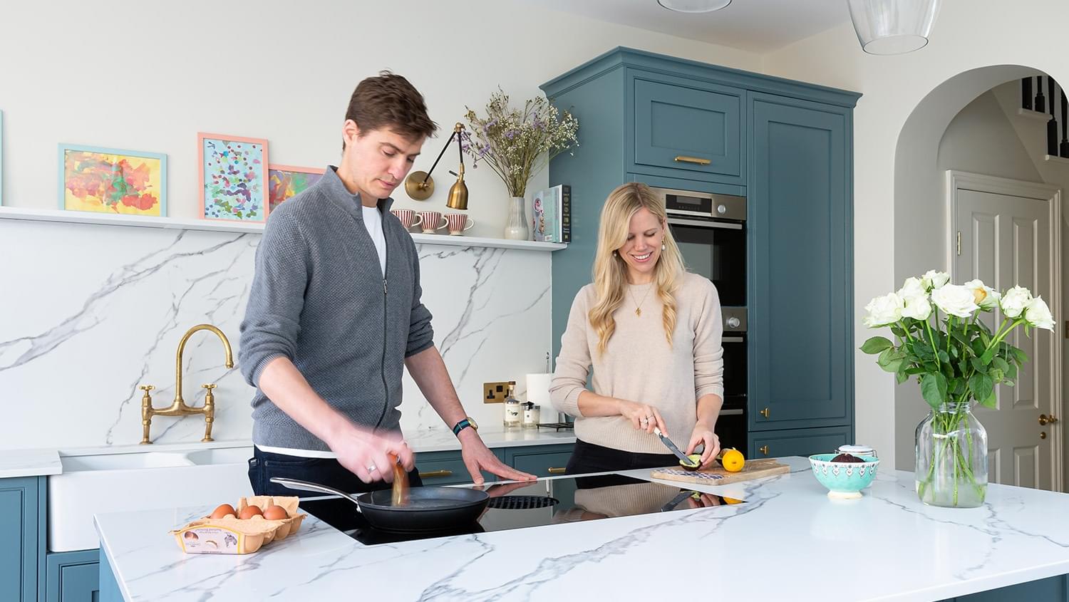
Matt Barber has left behind the Yorkshire estate of the 19th century for a modern London home. In their quest for a beautiful and functional kitchen, Matt and Cecelia opted for a stunning bold grey marble quartz surface from Gemini. With a marble-like quartz design that stands out among other surfaces, it was the perfect choice to add a modern yet contemporary aesthetic to their kitchen.
The dynamic design of this surface paired perfectly with the soft blue tone and enhanced the overall aesthetic of the space, making it a striking feature of their kitchen. Matt and Cecelia's eye for design and attention to detail truly shone through in their final kitchen design.
We are thrilled to have been a part of their kitchen journey and to have helped them achieve their vision for a stunning and functional kitchen space. Let’s find out where their design ideas came from and why their kitchen is a crucial space in their home.
How long did your kitchen renovation take?
We were doing a full house renovation. Everything was gutted. It was a lovely house but tired and needed work and we wanted to maintain the bones and character where we could. The kitchen before was tiny, with a big utility in the middle which had a wide opening door for the previous disabled occupant to access through. When we moved in, the cooker in the kitchen was literally from the 1950s! We used it for 6 months with a 3-month-old baby and it was challenging but makes us appreciate our new kitchen and the increased space that comes with it.
What was your inspiration behind your kitchen design?
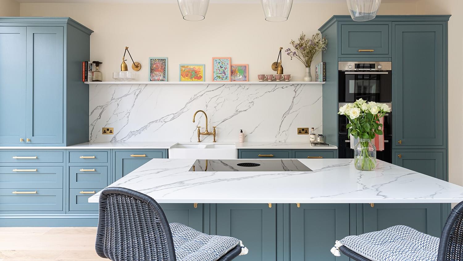
When considering the kitchen design, we were certain about two key elements. Firstly, we knew we wanted a shelf as per Eyeswoon, Secondly, having an open-plan layout was something we had always desired for our home. We wanted to create an open layout as this provides an increased sense of togetherness, making it ideal for us as we spend a lot of our time in the kitchen.
Where is your kitchen from? And what colour did you choose?
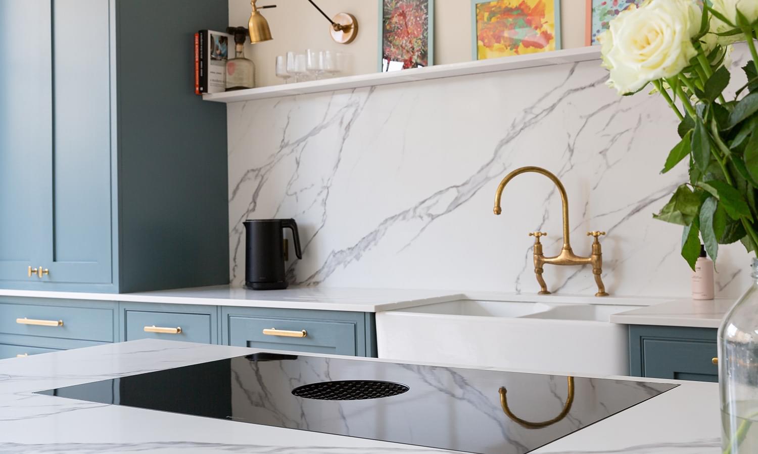
We chose a kitchen from DIY kitchens, and we went for the most expensive real wood and then had it hand painted in Farrow and Ball Barrow Blue. This blue would match the worktop choice beautifully and the white background and grey veining throughout would add a dynamic look to the space, especially for our splashback- we get so many compliments on it! It really creates a feature within our space and is often the first thing we notice as we walk in.
We noticed you have a BORA in your kitchen, what made you choose that?
When it came to selecting a hob, we deliberated between a BORA hob and a range cooker. While Cecelia was keen to have a range cooker as a feature in our kitchen, I was determined to have a hob facing into the room so that we could entertain while cooking. Additionally, having a sink on the island would mean that dishes and clutter would always be on show, which went against our preference for a modern and minimalist design. Ultimately, we agreed that the BORA hob was the perfect choice for our kitchen.
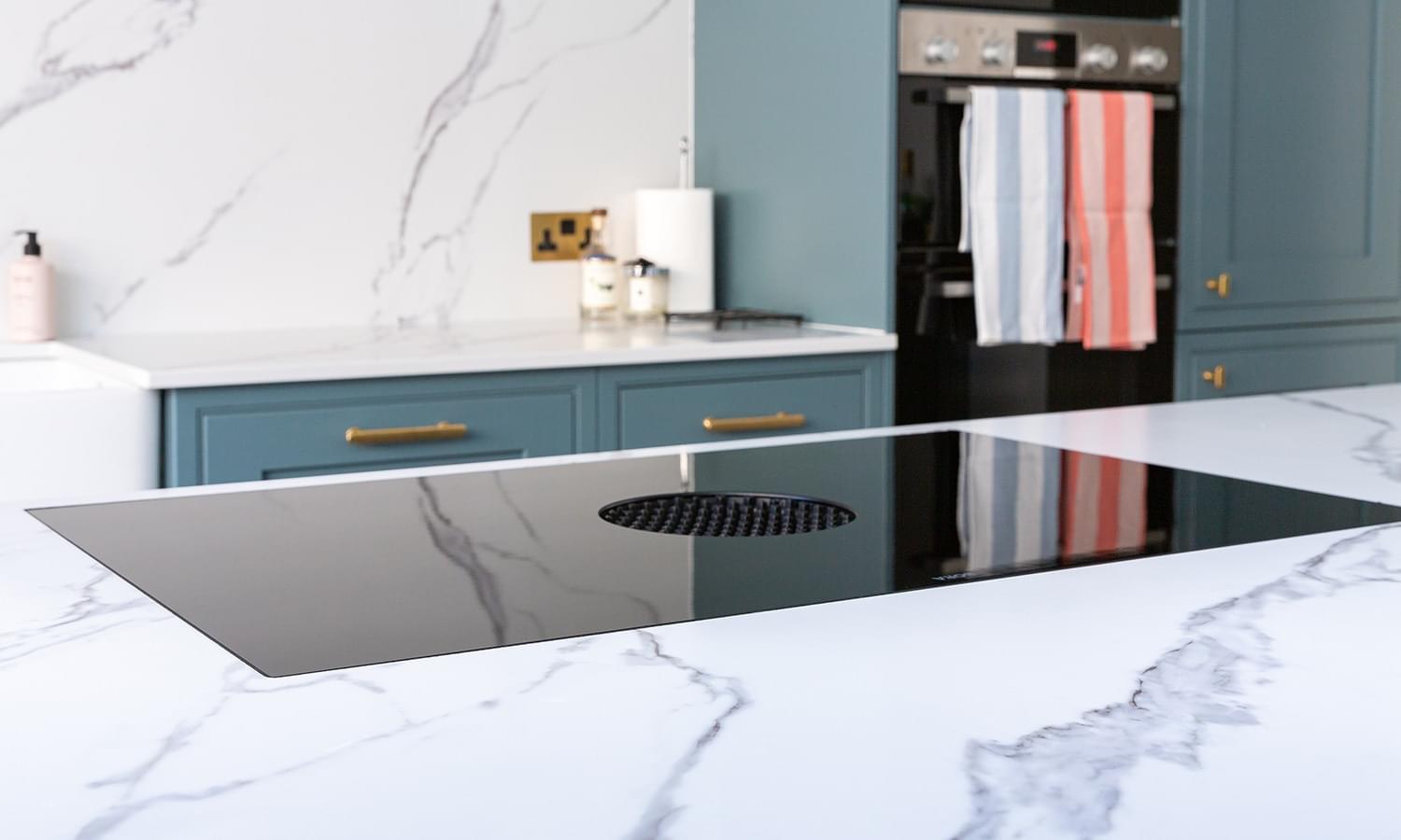
The BORA Cooktop top is more than just a sleek addition to our modern kitchen design - it's also an incredibly practical and efficient appliance that suits our family. As someone who loves to cook and experiment with new recipes, I can't imagine using anything else in the kitchen. Its smart design allows for precise temperature control and the ability to cook a variety of dishes which is great when it comes to mealtimes and entertaining guests.
The BORA hob is a true game-changer in the world of home cooking appliances. Its innovative design not only eliminates the need for a bulky extractor fan but also looks sleek and modern, perfectly complementing the aesthetic of our kitchen. We were impressed by its powerful yet silent operation and the ease with which it can be cleaned, making it an ideal choice for busy families like ours.
What is your favourite thing about your kitchen?
One of the standout features of our kitchen is undoubtedly the stunning worktop that we chose from Gemini Worktops. Both Cecelia and I were immediately drawn to the natural beauty of the surface, with its striking veining that runs throughout. We were particularly impressed by how Gemini was able to book-match the grain of the worktop across the backsplash to the work surface, creating a seamless and sleek design that perfectly complemented the overall aesthetic of our kitchen.
Our friends and family are equally impressed with the kitchen worktop, and we receive countless compliments on it whenever we have guests over. It truly serves as a statement piece within our kitchen, adding a touch of elegance and modern sophistication to the space.
Another aspect of our kitchen that we absolutely love is how open and social the design is. As someone who enjoys cooking and experimenting with new dishes, I appreciate having a space where I can interact with my loved ones while I host and cook. Our kitchen has become a hub for family gatherings and social events, with plenty of space for everyone to gather and enjoy each other's company. Our kitchen's design provides the perfect excuse to show off our stunning worktop and other features. We love nothing more than hosting dinner parties and entertaining our guests in the beautifully designed and functional space that we have created.
Overall, we couldn't be happier with our choice of worktop and the overall design of our kitchen. It has transformed our space into a warm and inviting area where we can all gather together with plenty of space.
Did you have to compromise on any elements of your design?
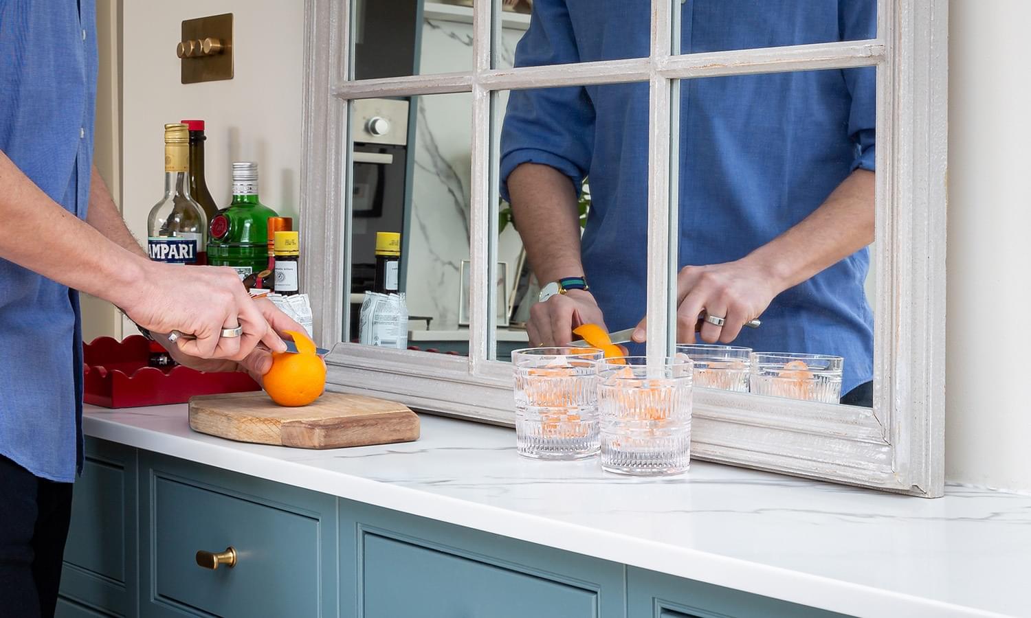
When designing our kitchen, Cecelia and I had to make a few compromises to ensure that the space met both our practical and aesthetic needs. One compromise was our decision to install two freezers instead of an American fridge-freezer, which Cecelia had initially favoured.
I was concerned that placing a bulky fridge-freezer by the door entrance would close off the room and disrupt the flow of the space. Our neighbours had a similar design style to what we wanted so we used their kitchen for inspiration, and we decided to install half-depth units in the space instead.
This solution worked out incredibly well, and the area has become a kind of "dresser" where we store glasses, linen, and other essentials. It's also proven to be a great spot for our two freezers, which we use frequently as a family that loves to cook.
In addition to the added freezers, we also made the decision to place our washing machine and dryer in a separate room. This move has really helped by providing us with more space and storage options in the kitchen. Having the washing machine and dryer out of sight has also made the kitchen feel less cluttered and more streamlined.
Overall, we've found that making a few strategic design choices, such as installing two freezers and placing our washing machine and dryer in a separate room, has made a significant difference in the functionality and overall aesthetic of our kitchen. We highly recommend these solutions to anyone looking to optimise their kitchen space and create a more functional and beautiful home.
How have you been enjoying your kitchen since it was finished?
More recently, our kitchen has taken on a new role as the central hub of our home. With most of our time spent in there, it's safe to say that our living room has become more of a secondary space, reserved primarily for TV watching. We've found that our kitchen not only serves as a functional area for cooking and dining but has also become a place for socialising and relaxing.
Gathering around the kitchen island with friends and family, cooking up dinner, or simply enjoying a cup of coffee has become a favourite pastime for us. The kitchen has truly become the heart of our household, a place where we can connect and spend quality time together.
It's no wonder why we take such pride in being a part of Matt and Cecelia's renovation journey, helping them to achieve their dream kitchen. Seeing the joy and satisfaction on their faces as they enjoy their new space is incredibly rewarding, and we look forward to helping many more homeowners create their dream kitchens in the future. After all, the kitchen is more than just a room; it's the heart of the home.
Interested in a quartz countertop for your kitchen? Get in touch for a free, no-obligation quote today.