You may recognise Rachael @beetrootandblack from our kitchen stories back in Summer. Her kitchen renovation journey began with a showroom visit and a mountain of ideas. She wanted to create an open space for her family, with a traditional yet modern style. As the heart of the home, it was vital that her kitchen layout was an open space that reflected her style choices and had the functionality and practicality for busy family life.
Rachael wanted to create her dream kitchen, with a style that stood out and her colour choice was no different. Her inspiration for her colour scheme came from wanting to create a dark and moody atmosphere with a traditional twist. “I love how moody and cosy it can make a room, especially a big room. I think it kind of draws it in.”
As a south-facing kitchen, it’s a
light and bright room which works perfectly with the dark colours, which add
visual interest to the space. Rachael wanted to take advantage of the whole
space and that’s why her renovation project involved opening the kitchen into
the connecting rooms, she created a much-needed space that was perfect for
cooking, dining and more importantly, her busy family life.
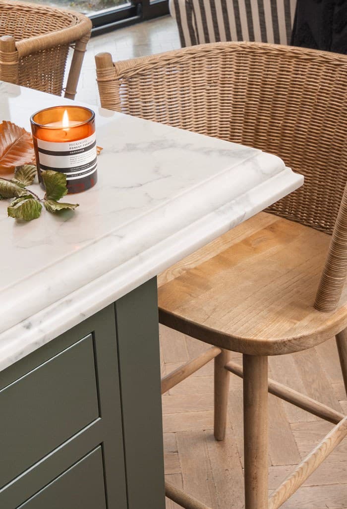
When choosing her worktops Rachael was keen to incorporate marble-style countertops for her surfaces, but was unsure if this would be the right choice for her kitchen. However, "Gemini’s Calacatta Silver Superior was the perfect solution as it has the same heavy-veined marble look I love, but there’s a lot less maintenance needed."
The countertops and walls were light making them a perfect contrast to her deep green cupboards. Rachael is known for her bright, bold colour choices and her new kitchen would be no different. Her 'colour confidence’ comes with experience, she is used to experimenting with colours to create the perfect aesthetic within her home.
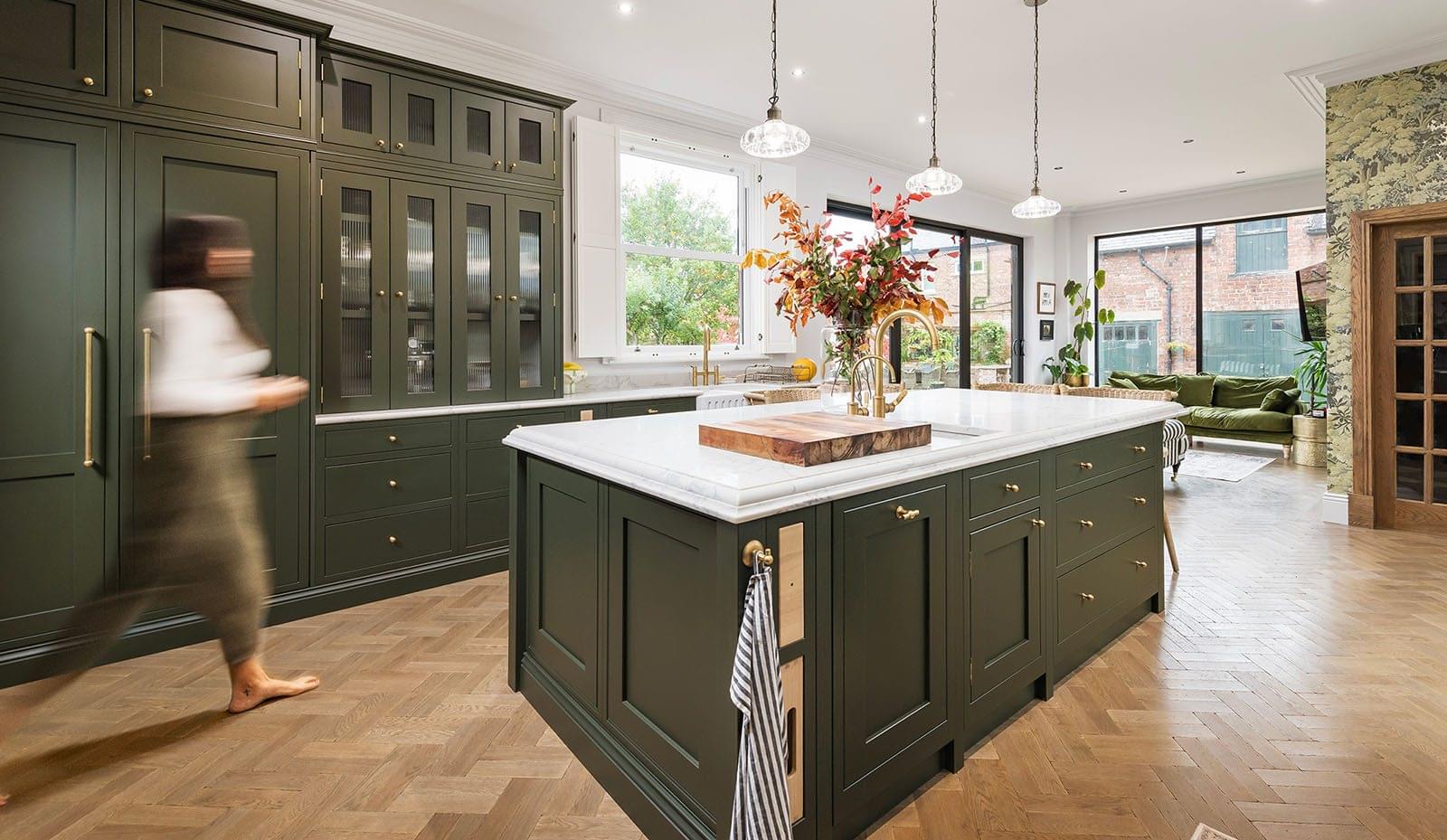
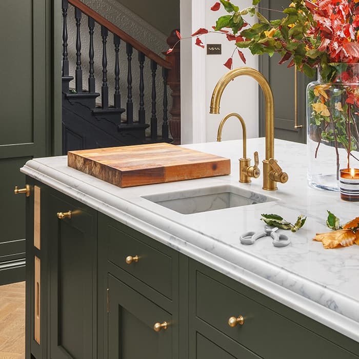
Rachael’s design explores a range of features and styles that help to create the kitchen of her dreams. The large island in the centre of the room is a standalone feature. With a 60mm depth, a double ogee edge and ornate detail, this is the perfect centrepiece for creating that traditional style that Rachael was keen to achieve.
Within the island, Rachael opted for an AXIX sink, a combination of the Calacatta Silver Superior surface with a contemporary steel bottom to give a designer-finished look.
Designing the sink on the island adds purpose and utilises the space.
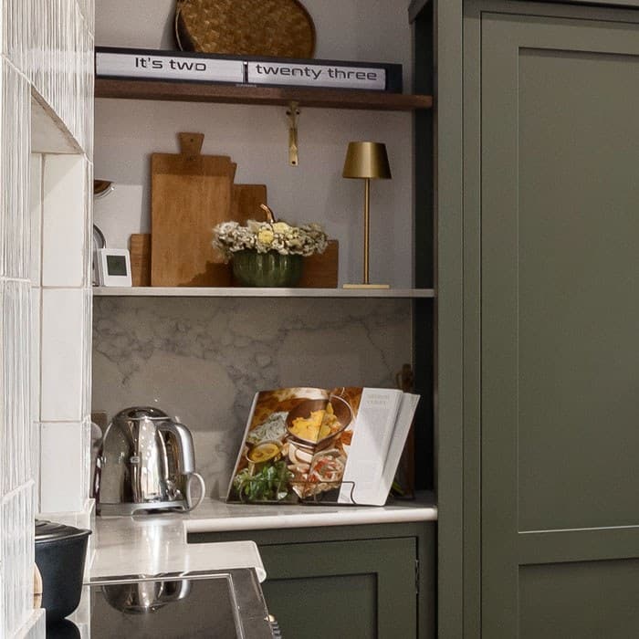
Whilst taking advantage of unused space and adding a feature to her kitchen, Rachael wanted to incorporate a floating shelf to make the most out of an unused corner, this became the perfect space to display her cooking essentials and her cookbooks.
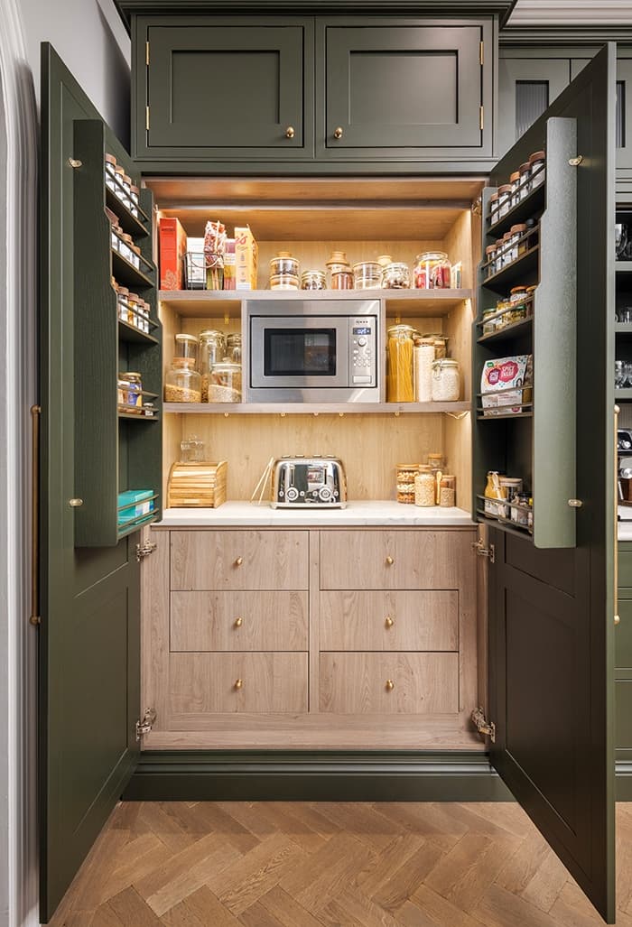
Whilst opening out the kitchen was essential, Rachael wanted to create enough storage space so her kitchen would have a clean and uncluttered aesthetic, adding a pantry was the perfect way to do this.
She was able to use the larder cupboard to conceal her appliances and dry foods, by making use of the full cupboard space, she was able to add spice racks to the door, this way her spices and herbs could be displayed in an organised manner for her cooking needs.
Read Part One of Designer kitchens feature big, brave colour choices to see how Rachael started her project.
Interested in one of our quartz surfaces for your kitchen? Get in touch for a free, no obligation quote today.